It was time for a change.
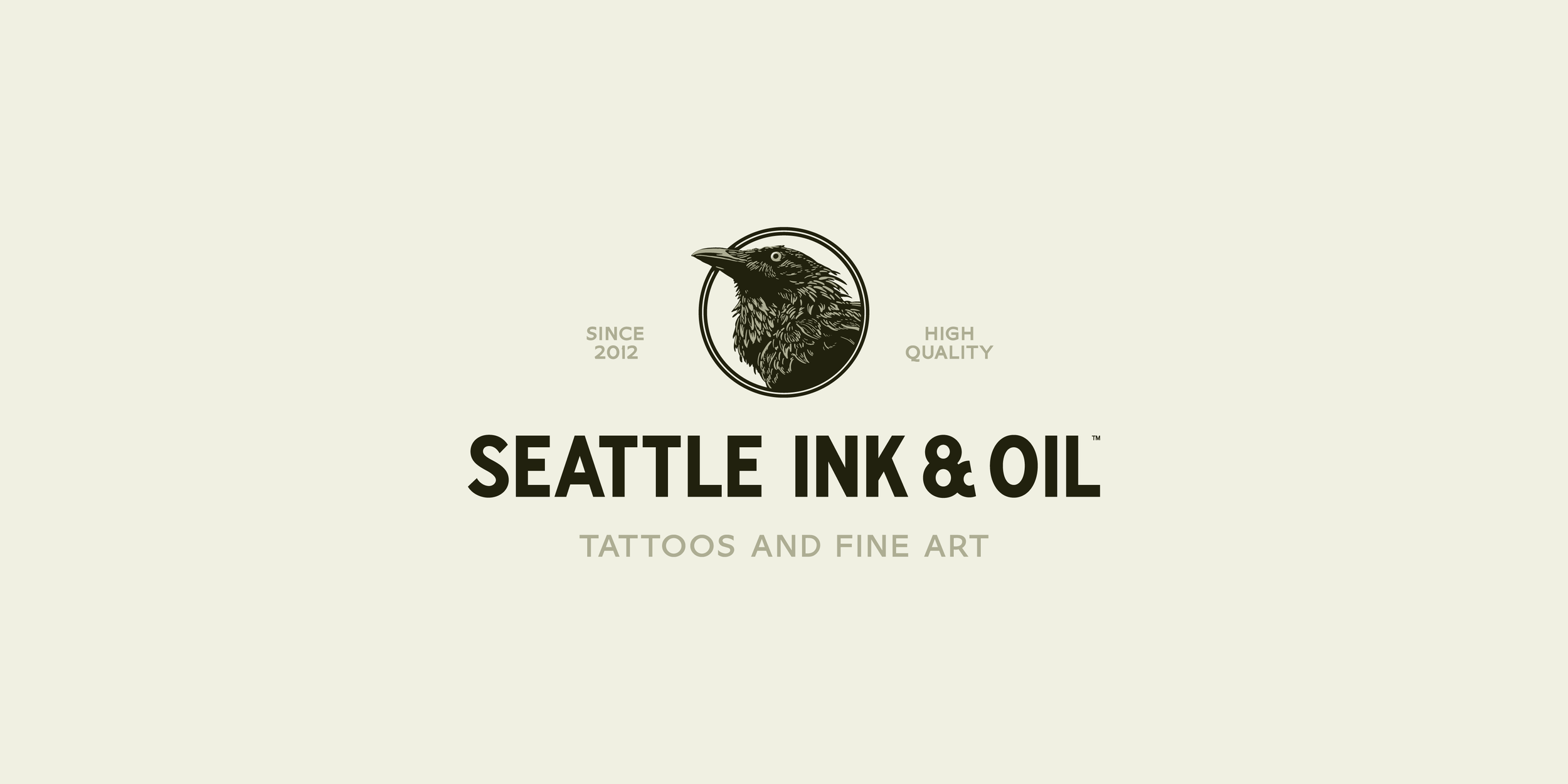
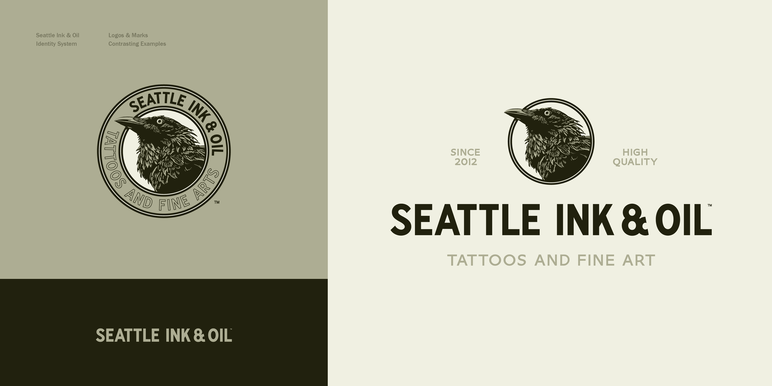
Having settled in to the historic Rainier brewery in Seattle’s SODO district, it became apparent the crisp, modern aesthetic origins of Seattle Ink & Oil’s brand was in need of reconsideration. Through many conversations and ideation sessions, it was decided to retake the elements of the tattoo company’s first logo and give them a heritage vibe. We culled inspiration from a wide array of old photos of the city, the developing business, and the advertising on the walls of factory buildings throughout the neighborhood.

“I want it to look like it’s been here all along.”
— Justin, Founder
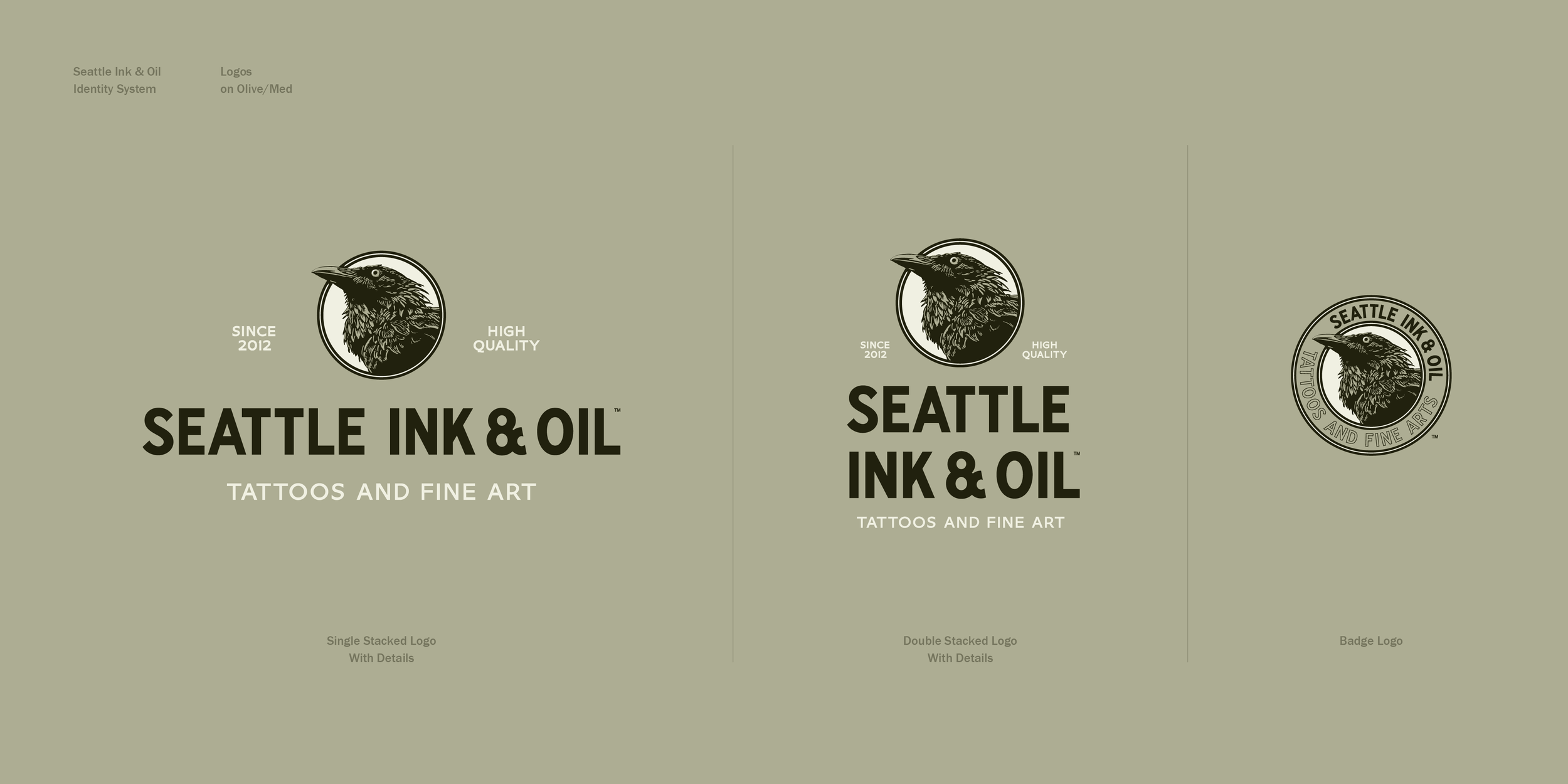
So we set out to do just that—develop Seattle Ink & Oil’s appearance into one of a modern day heritage brand. We explored many sources of inspiration and aligned on what key elements resonated most, and why.
Though time consuming, once you’ve got a clear sense of direction for the vibe, the inspirational energy excites you to pick up the work and make some strides. Over the course of several months we whittled away at this until it felt ready to release into the wild.
What follows, illuminates a bit of the process, and a bit of the outcomes.
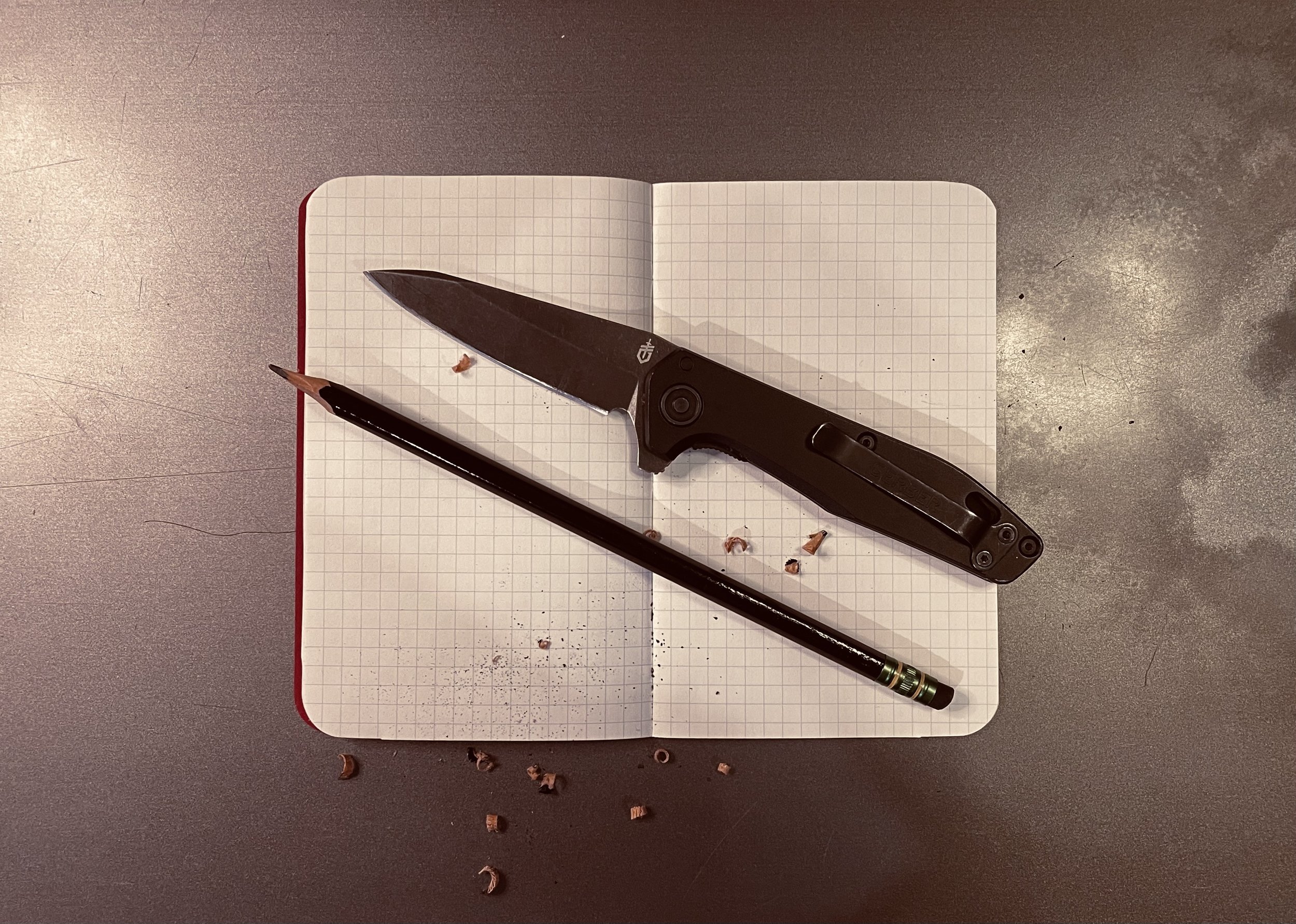
Sharpen your pencil.
The only time I feel like I actually succeed at a good idea is when I’ve started the process with a pencil and paper. Nothing else allows for the same free flow of thought into shape. Sharpen your pencil and begin making what you want with absolute freedom.
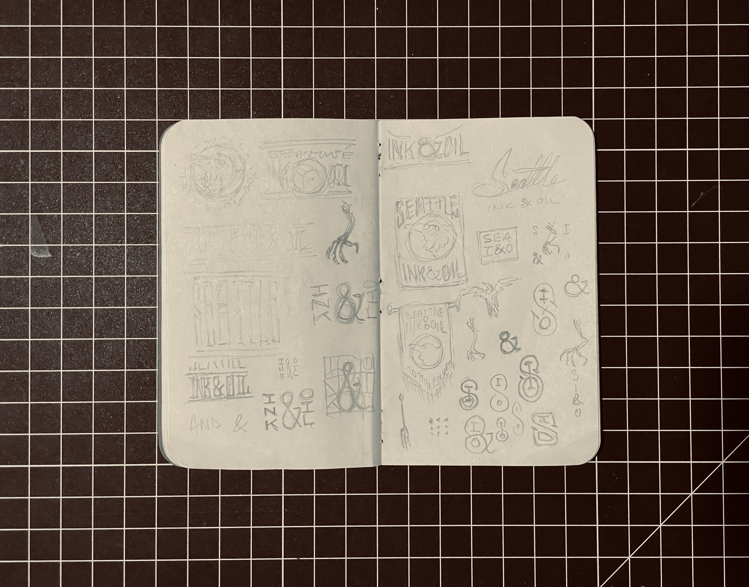
I have a vibe that I’m looking for with each quick scrub of the pencil, an angle, something specific begins to develop in my head, and after a while of drawing it seems to come to life within, and the graphic on the page reminds me.
Once I have an idea in my head, I look around for the right references, and start to increase the detail or fidelity of the idea and see how that develops.


Through a predominantly digital workflow, I begin crafting the vectors, creating illustrations, and exploring type samples. This is both separately and together, expanding and contracting the ideas and feeling it out along the way—learning what to keep and what to leave behind.


A wise and well named man once said, “Vectors are free!” and I’ve adopted that mentality. Duplicate, change, and riff it rather than sculpt from scratch. I find that similar to sketches, it works the idea sharp in my head, and then I figure out all the details in real time and it comes to life.


enjoy it, but try and break it.
A logo is never done until it’s been proven in the wild. Luckily a computer can fake it enough to get the idea, and you can see where it feels real good, and where it sucks—and then you fix it.
Once it’s been applied and fixed a few times digitally, I start ordering samples and see it in real life, that’s when it only takes a little to tidy it up, and then we release it.


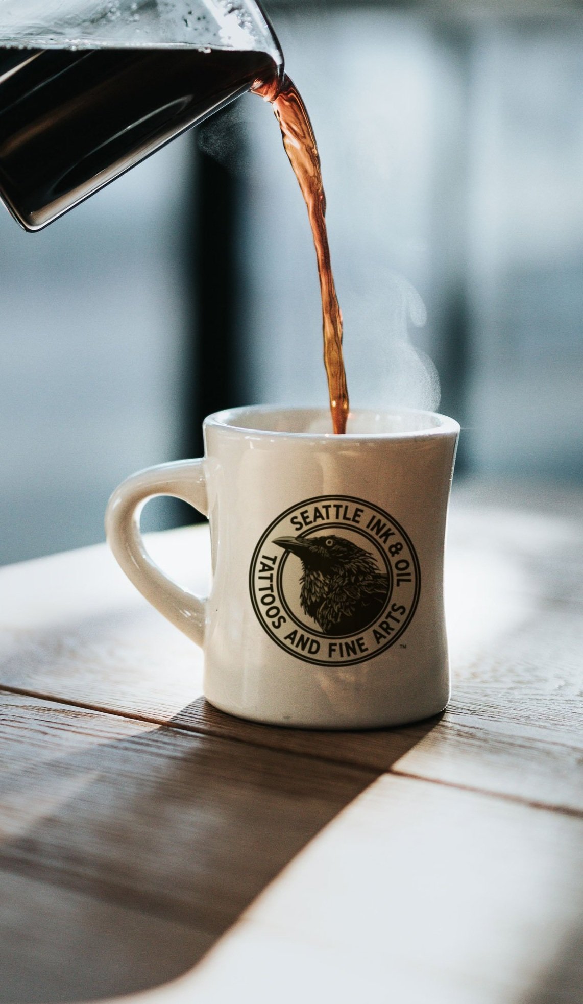

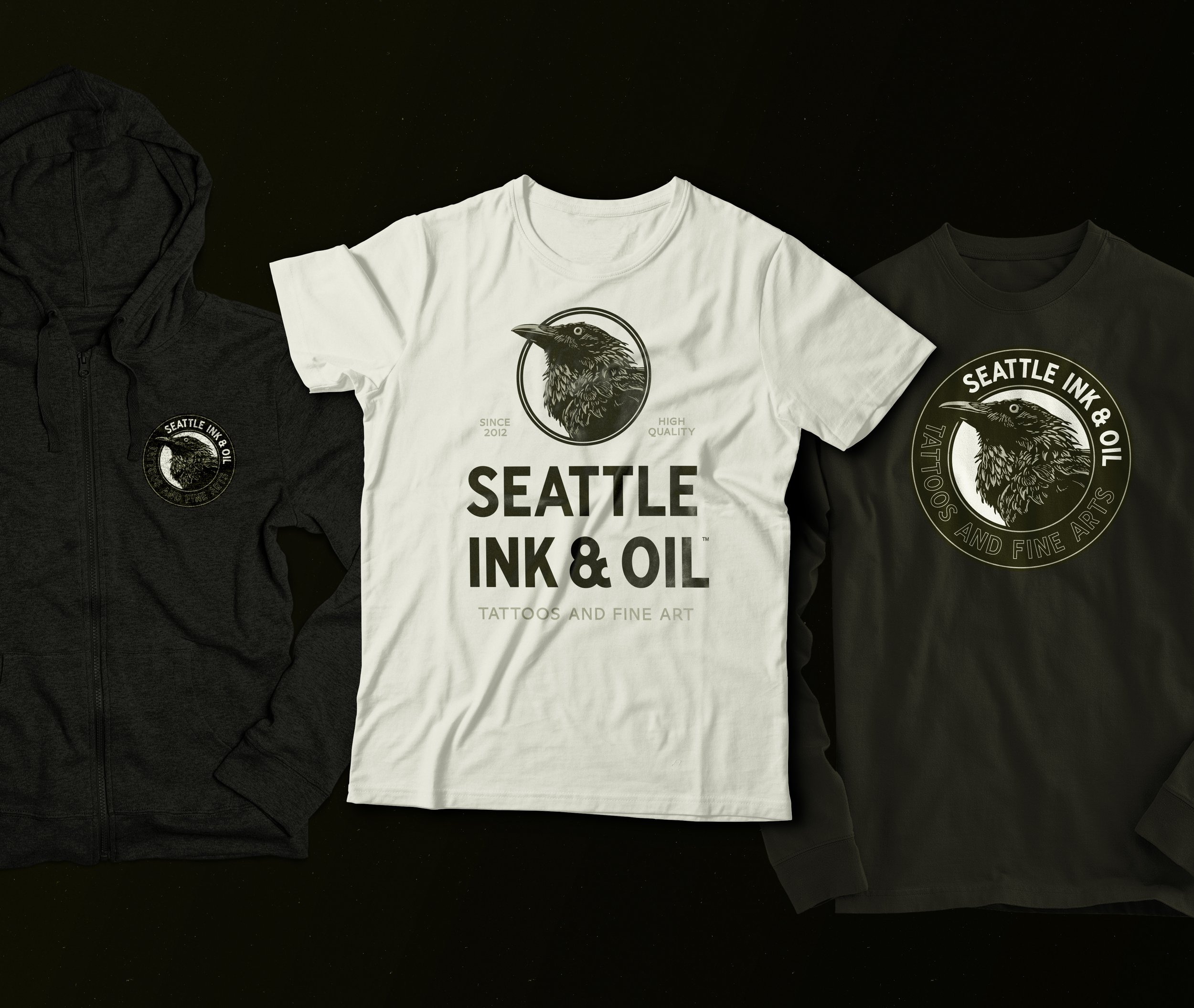
Apply the logos to everything you think you’ll have to in the future—see what works, or what doesn’t.
Logos are great. Vectors are great. But, only reviewing a crisp digital proof can be misleading. You have to see it printed and produced materially to see if it landed. Apply it and see what it ‘actually’ looks like. You’ll know then if it’s ready or if there’s any last thing you can do to improve it.

Brand to Launch fully in q2 2022.
fin.